Julianne's Wireframes
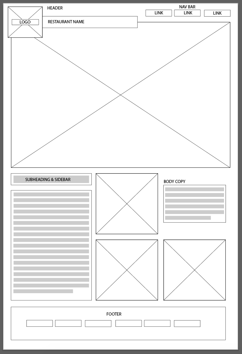
Desktop Wireframe

In order to portray the modern, fresh, healthy vibes of this new local restaurant I would use the following elements. For fonts, I would use sans-serif fonts to keep up a modern look. My colour scheme would be a light happy mix of green, grey, white and black to keep up the fresh modern look. I will be using appetizing images from the restuanrant to advertise the food avaliable. These pictures will tie together the green feel of the page to help portray healthy vibes. Finally the background will be white to keep a clean crisp look.
Mobile Wireframe
