Julianne's Desktop VS. Mobile.
final task.
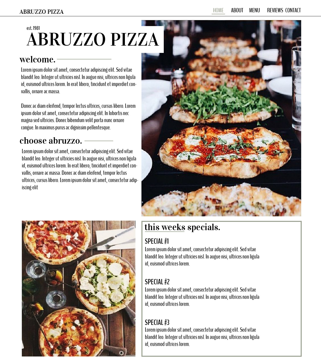
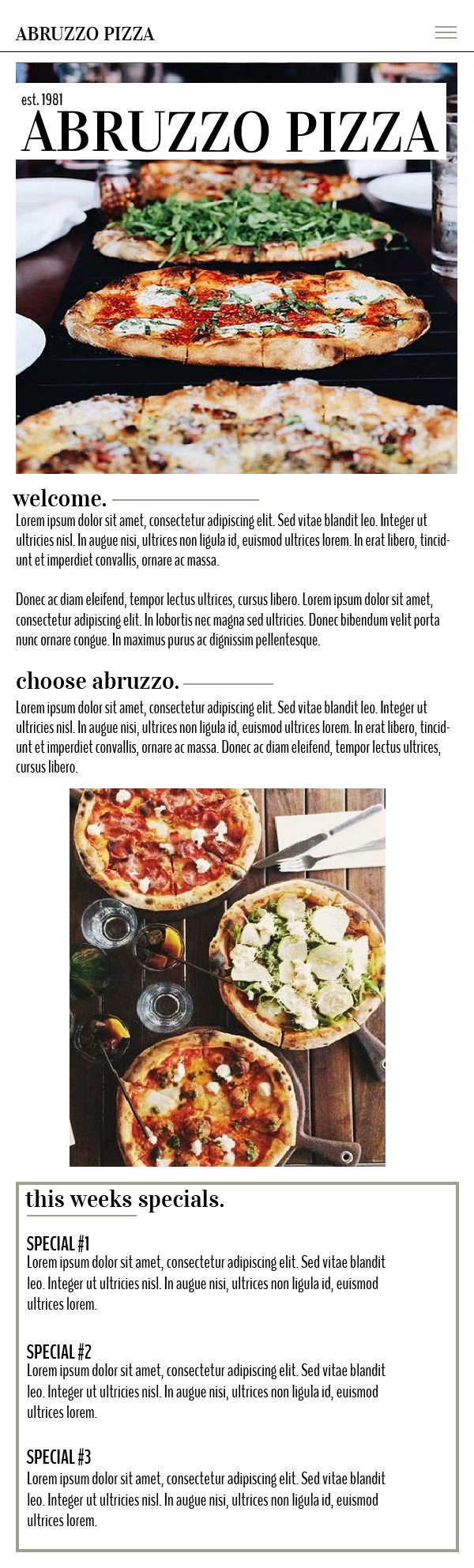
The minimalist and clean qualities of my mobile design will make it stand out. Utulizing the green, white and black colour scheme throught the page, including the pictures, it gives the design a easy flow that is appealing to the eye. The hamburger menu pulls the nav bar into an easy to access nav that can be reached from anywhere on the page. Slightly smaller fonts and smaller paragraphs compared to the desktop layout create an easy to navigate feel that rivals the desktop layout.